


Results
My team successfully launched a previously stalled accessibility feature on Search, overcoming a three-year development bottleneck. This project measurably improved the search experience for over a million users, making Search truly usable and accessible for all. Additionally, we developed and implemented a scalable framework that was adopted across all Search verticals, demonstrating its value and wide applicability.
Lessons Learned
Early and Frequent Collaboration:
Regular demos and communication with engineers throughout the design process are essential to ensure alignment, identify potential challenges, and proactively address them.
Clear Visual Communication:
Clearer and more organized engineering handoffs would have saved me a lot of time auditing design demos.
•
2020
Google possesses one of the most powerful mission statements: "Organize the world's information and make it universally accessible and useful." As a designer, I understand that great power brings great responsibility. I have identified an issue that undermines our mission statement by rendering search less than fully accessible and useful.
Role
Lead Interaction Designer
Responsibility
UX/UI
Accessibility
UX Framework
Prototyping
User Journey
Problem
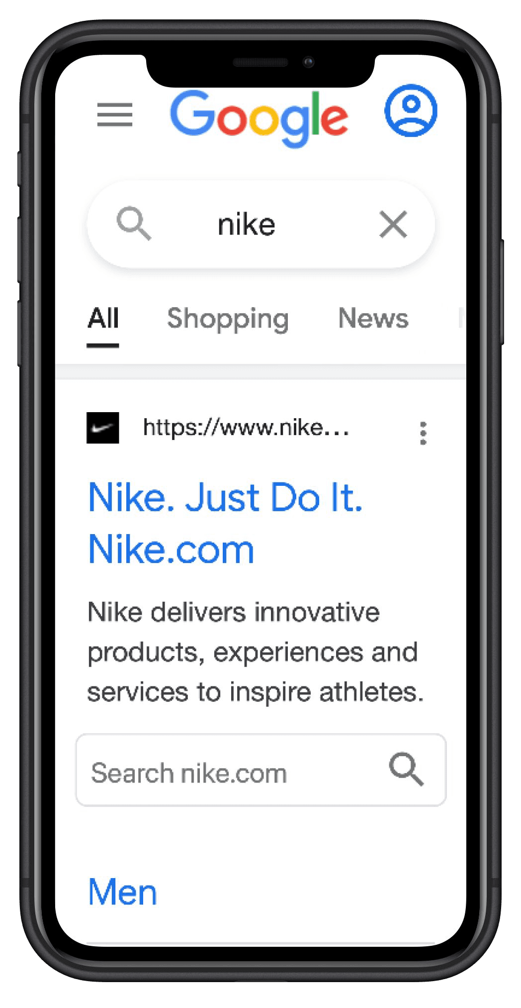
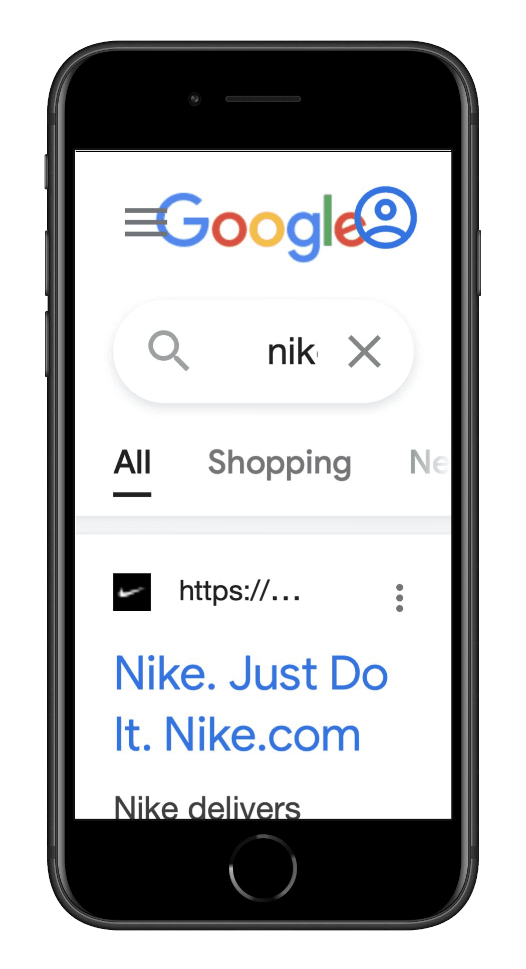
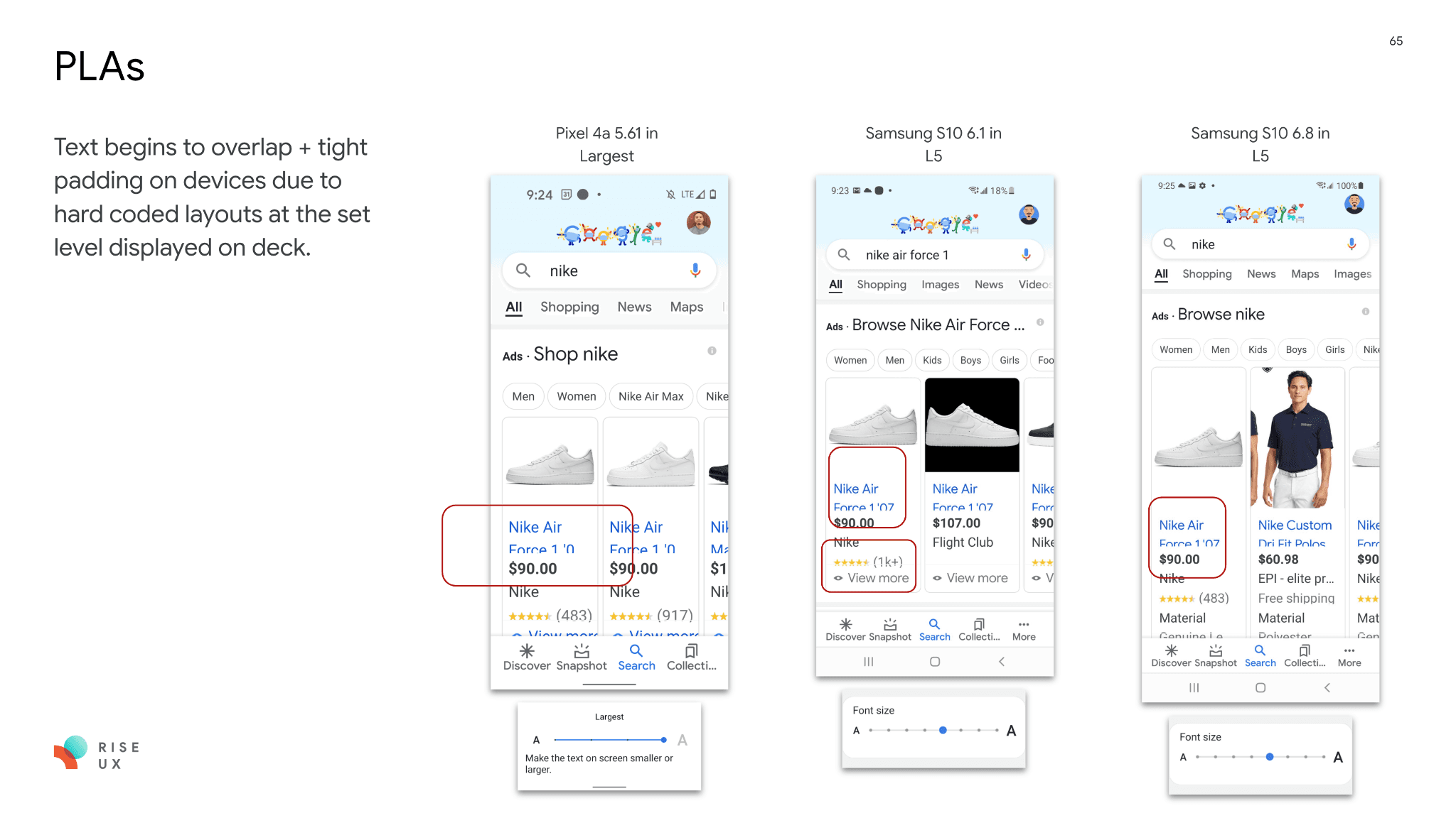
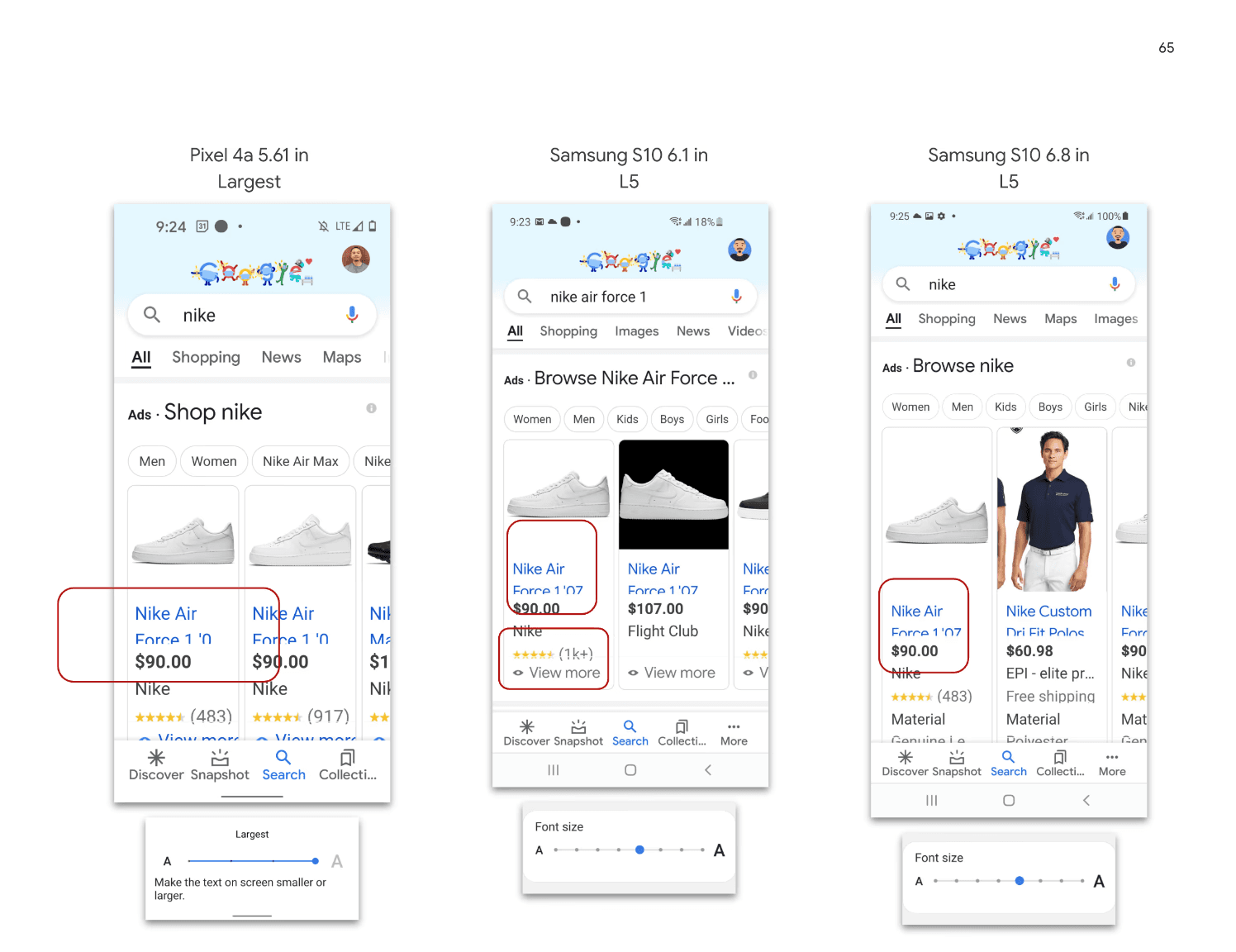
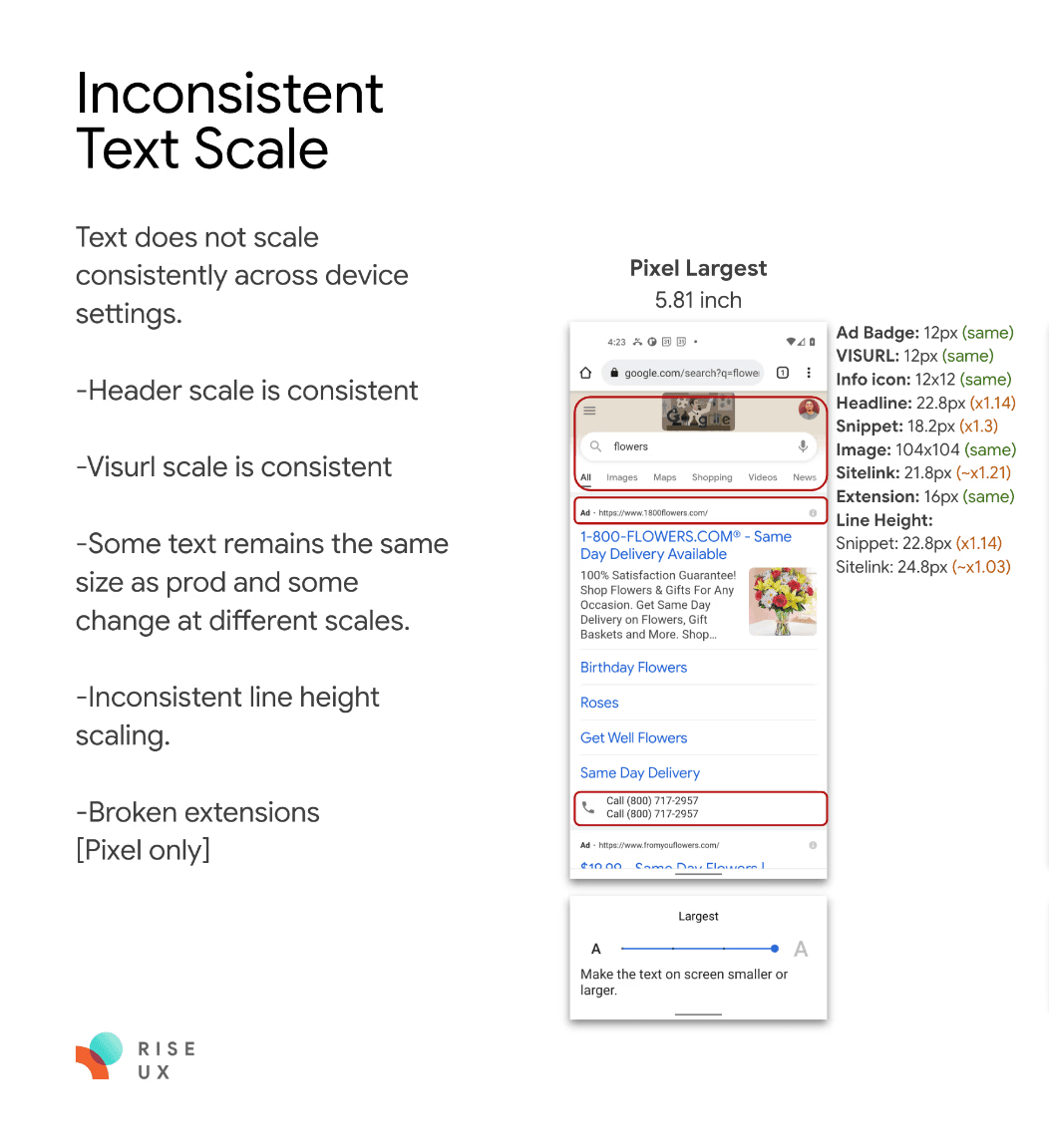
Mobile web in 2020 lacked font scaling capabilities. Although the Google app included font scaling, its implementation was unreliable, exhibiting bugs and inconsistent behavior across various browsers, devices, and applications.
Due to past accessibility limitations, font scaling was deactivated, resulting in an unusable UI. To address this, I worked with my ENG teram and initiated a thorough collaborative audit of Search. This extensive review encompassed over 100 queries and 20 result formats, pinpointing hardcoded UI defects and viable solutions.
Create Font Scaling Framework
To address the variance in font size settings between iOS and Android, I pioneered dynamic font scaling rules for Search, a feature previously absent. Working with the Product Manager and Data Scientist, we identified the ideal baseline font scale. I then defined comprehensive rules for font size, line height, icon specs, and padding, establishing a new foundation for accessibility.
How to Enable This Feature?
Modifying features that affect billions of global users requires meticulous planning. The font scale feature, in particular, presents complexities due to its diverse user base, encompassing a wide range of ages and demographics. In collaboration with a Product Manager and Data Scientist, I analyzed font scale user behavior and search patterns (specific details remain confidential). We explored various implementation methods through whiteboarding, user persona development, and user journey mapping.
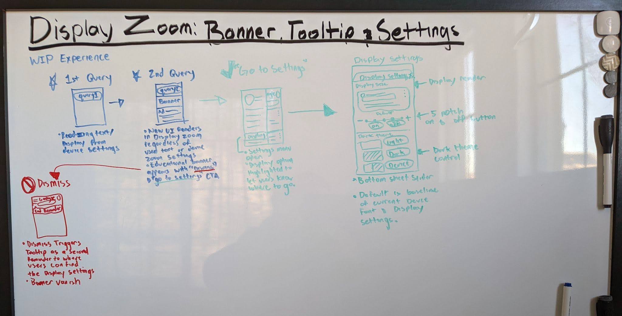
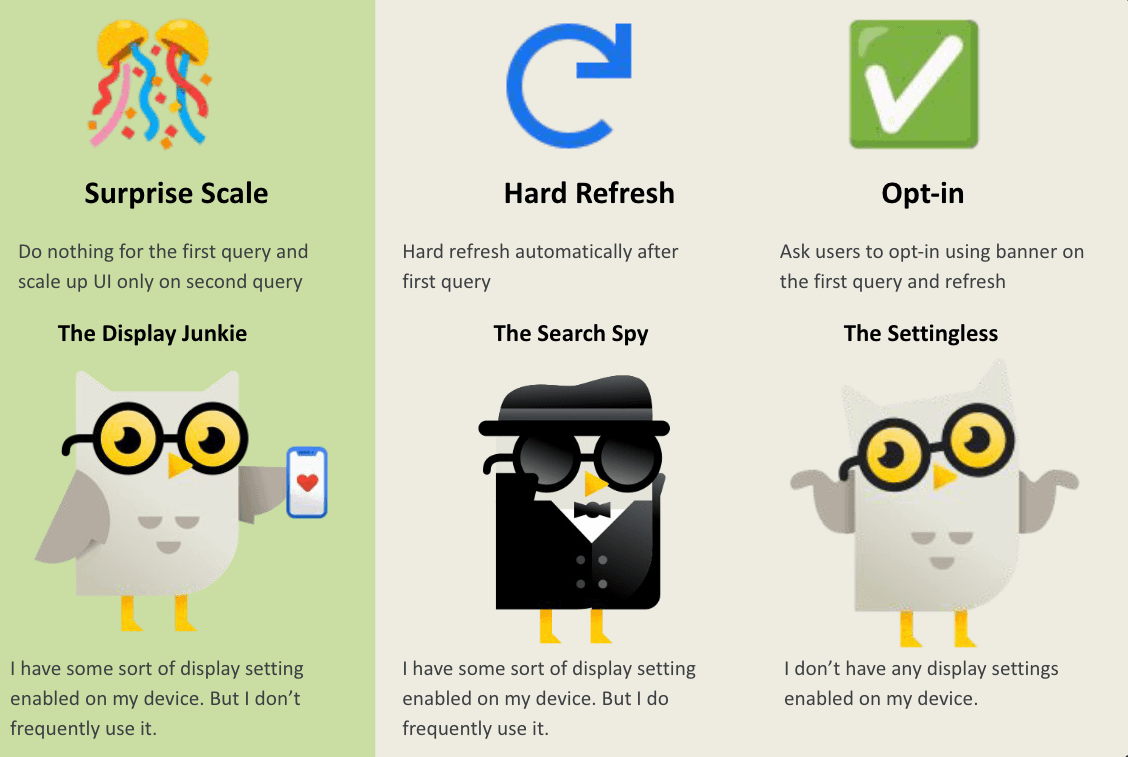
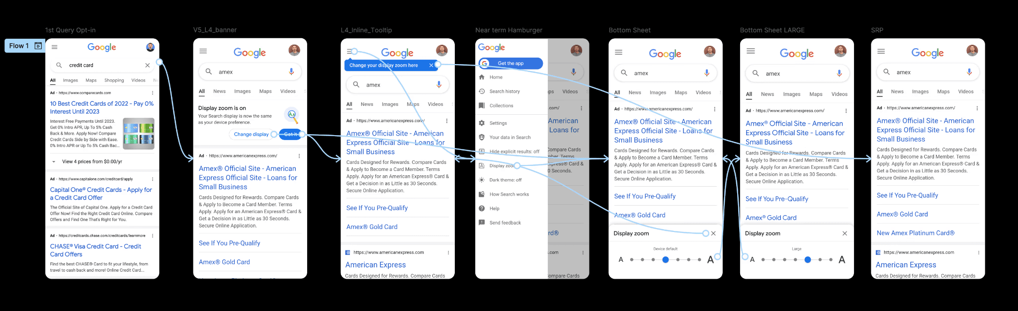
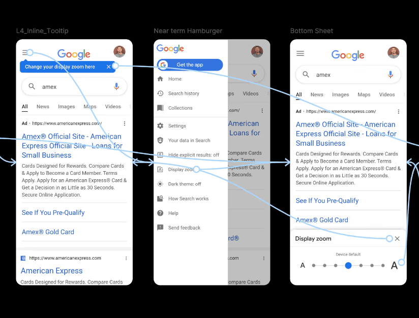
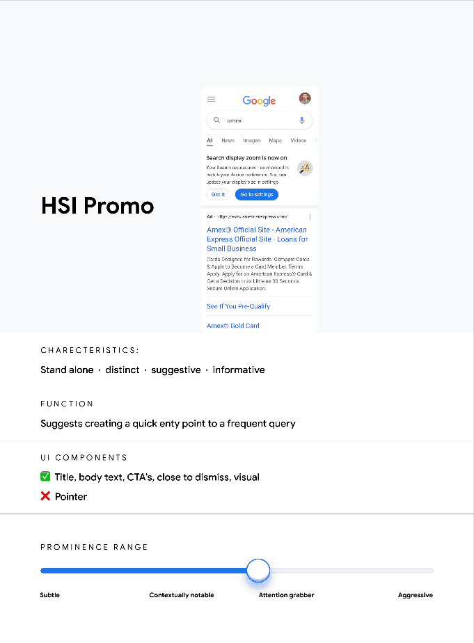
Initially, the team considered a prominent announcement banner and tooltip to inform users of the change. To visualize this approach, I created a prototype. However, based on the relatively small user segment utilizing font scaling and the fact that these users likely already have device-level font scaling enabled, I hypothesized that a silent implementation would result in a positive user experience. Essentially, the change would seamlessly translate to their search experience without requiring explicit user action.
To validate this hypothesis, I partnered with User Experience Research (UXR). The resulting data supported my approach. Furthermore, I leveraged insights from the successful implementation of dark mode to inform my design decisions. Ultimately, the team opted for a direct implementation, bypassing the initial MVP announcement strategy, based on the positive user reception confirmed by UXR.
Implement and Audit
With the framework and enabling method finalized, I collaborated closely with my Engineering and Data Science partners to ensure accurate implementation and design consistency across iOS, Android, browsers, and applications. Our team then conducted a comprehensive audit, reviewing over 1,000 demos over several months.