

Making Search readable for everyone
Adaptive font scaling for Google Search, designed as a system, not a setting.
Role:
Interaction Designer
Team:
4 PM, 8 ENG, 2 UXR, 3 UXD, 1 DS & 3 VP
Timeline:
~1 year
The problem
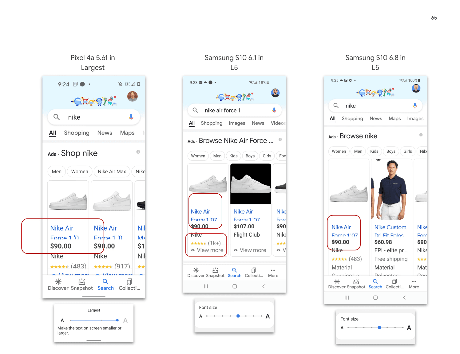
Google Search text didn't adapt to a user's preferred reading size, making results hard to read for people with low vision, or anyone who simply wanted larger type. An accessibility fix for this had stalled for three years, because it kept being treated as a surface tweak rather than a systems problem.

The tension
Search results are dense and information-rich. Scaling type up without breaking layout, hierarchy, or the relationships between elements is hard. The real problem was treating typography as a responsive system across a complex page, not just enlarging a font.
The hardest decision
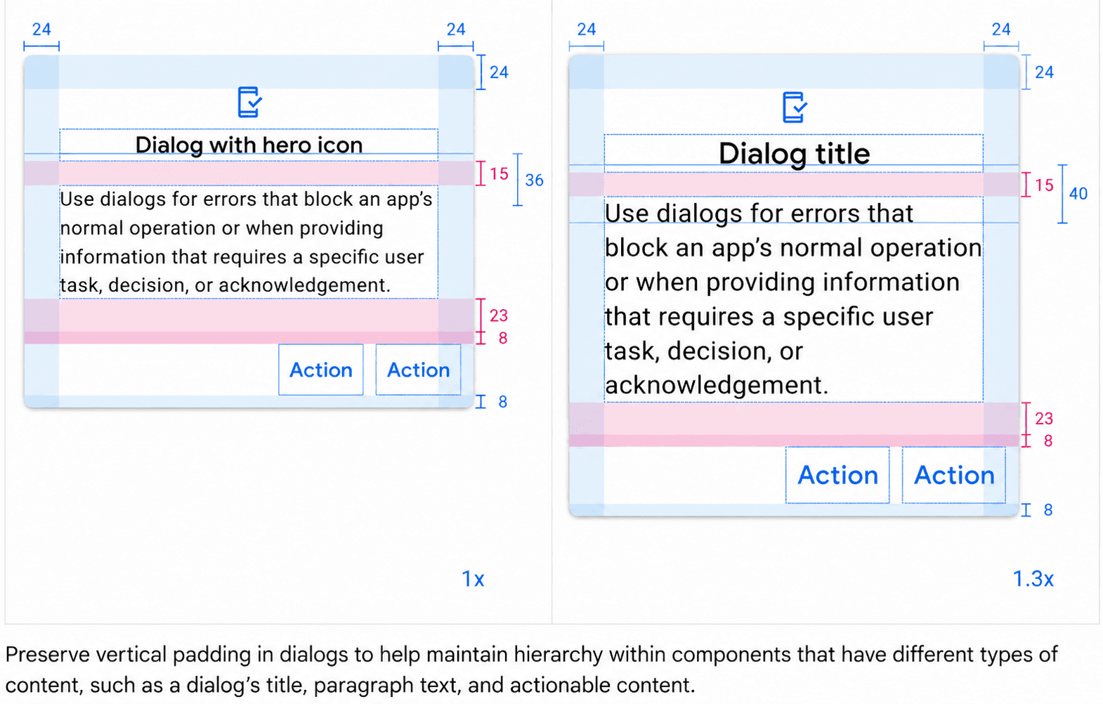
Instead of patching font sizes, I reframed typography as a responsive system with scaling rules that had to hold across every Search vertical. That reframing is what revived a feature stuck for three years. I defined the rules, proved they scaled cleanly, and aligned engineering and PM around finally shipping it.
The system
A font-scaling framework with rules applied consistently across verticals, so type stayed legible and hierarchy held at every size.
Impact
Shipped to over 1M users, adopted across every Search vertical. The engagement it unlocked helped drive new ad and search formats, contributing to billions in incremental revenue.
What I'd change today
I'd bake the scaling rules into the design system as tokens from day one, so every new vertical inherited accessible type automatically.